Feyi Oyediran
A graphic designer and multimedia artist.
About
pronounced: (faye oh-yed-ur-an)
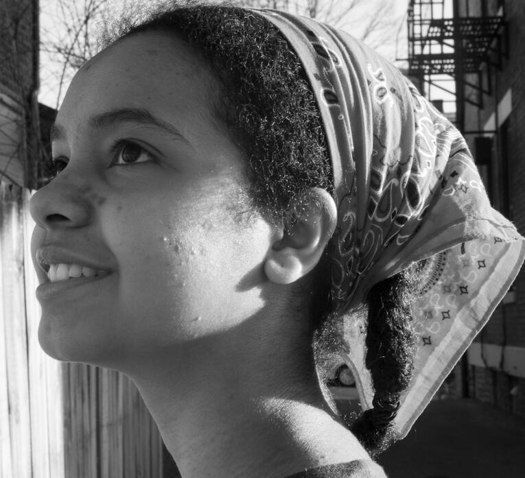
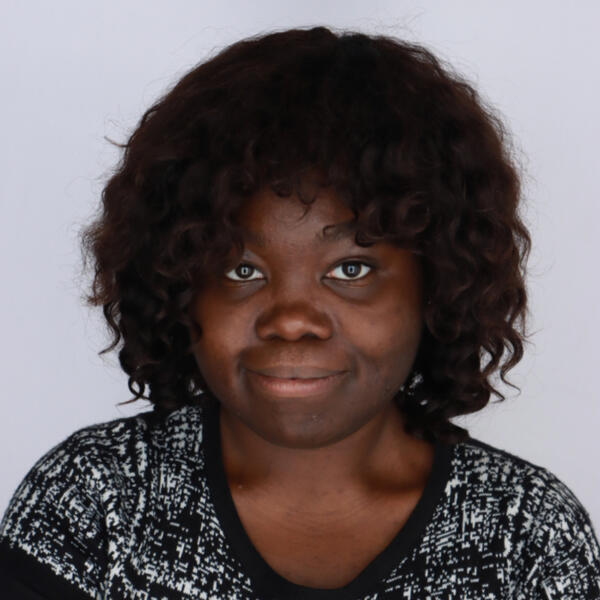
she/herFeyi Oyediran is a Cincinnati-based designer and artist studying at the University of Cincinnati. She previously completed her Associate of Applied Business at UC Blue Ash, with a concentration in communication design.513-349-6725
[email protected]
Portfolio
Digital Art
Photography
Graphic Design
Projects
Invitation
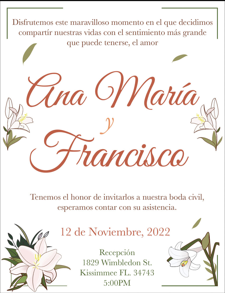
I was approached by a client for the request of making a wedding invitation for a family members' wedding, with the caveat that it be animated.
After some back and forth, I composed a draft in After Effects based off of the animations they were hoping to see.
Afterwards, we talked about some more specific elements they wished to see:
Autumn themed colors
White Flowers
Tighter pacing of the animations
Some adjustments to the typography
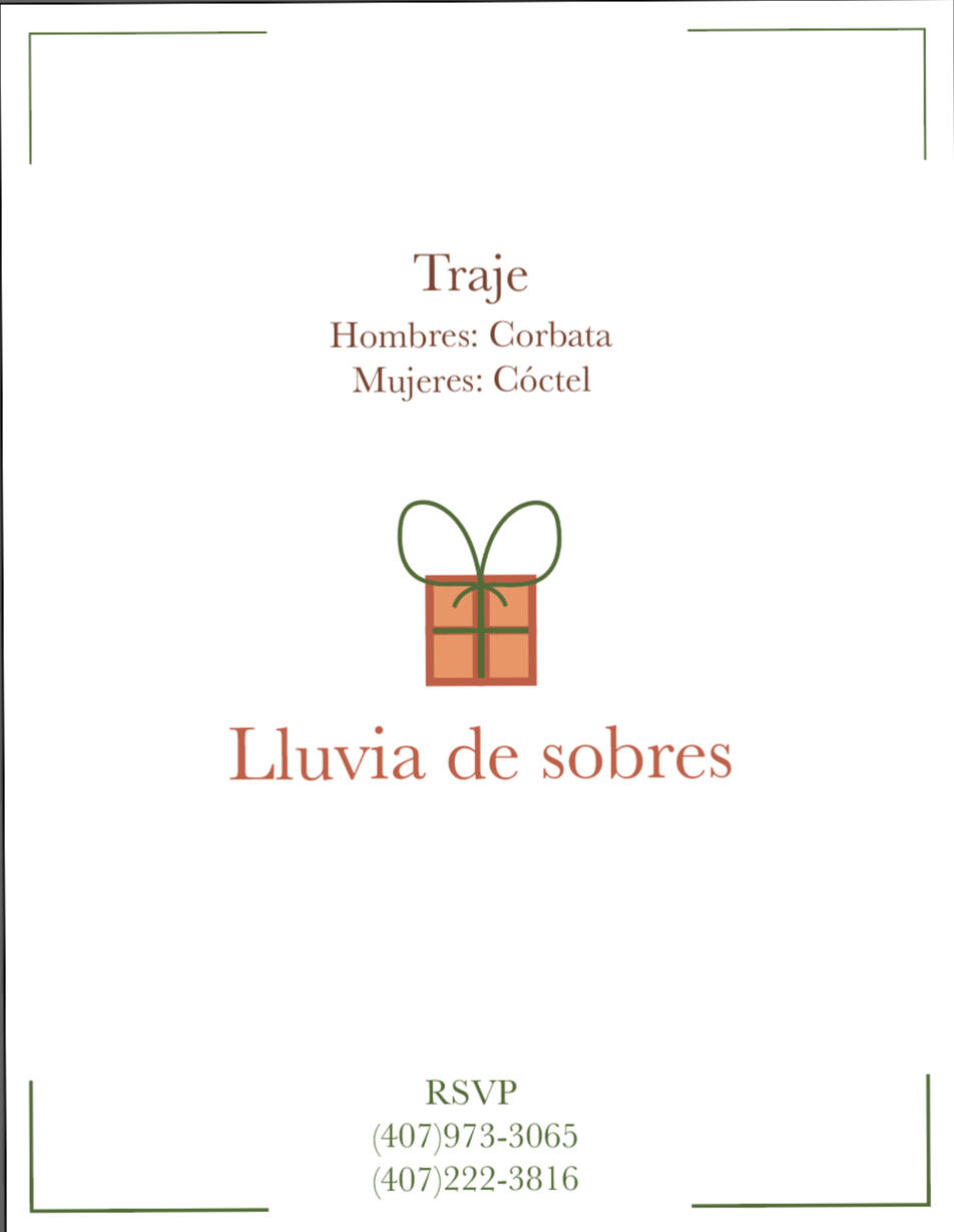
"Rainfall of envelopes" theme for the gifts
Music track requested
Text in Español
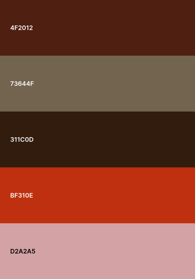
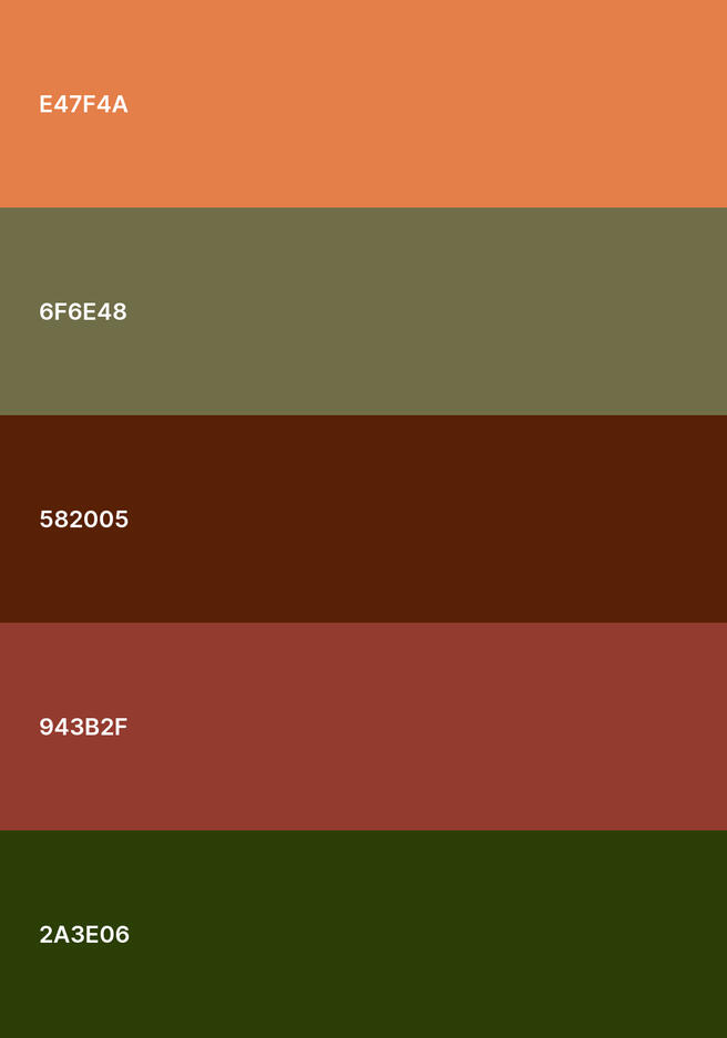
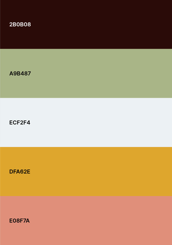
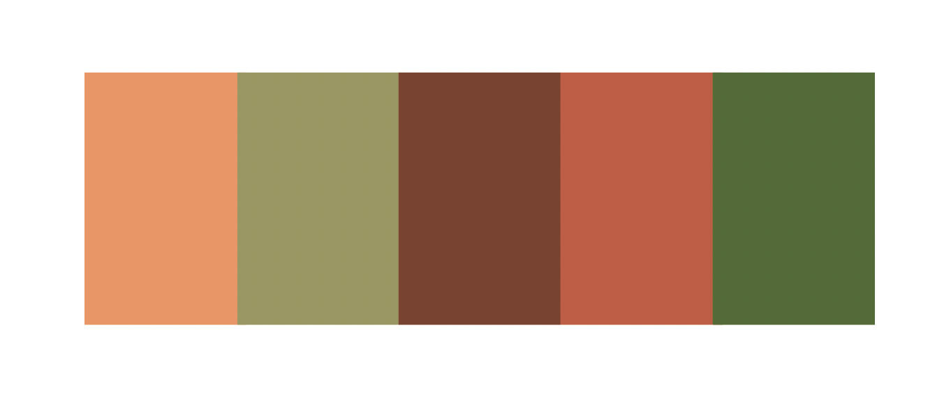
I put together 3 palettes for the client to choose from. Their instructions were for fall themes, but nothing too "stereotypical". With this in mind, I shied away from reds and elected to pick out more earthy and muted colors.
The next step was deciding on the final palette and arranging the text.
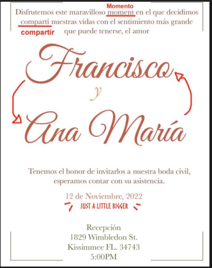
Client wanted a pastel version of palette #2, reversal of names, and some word and size corrections.
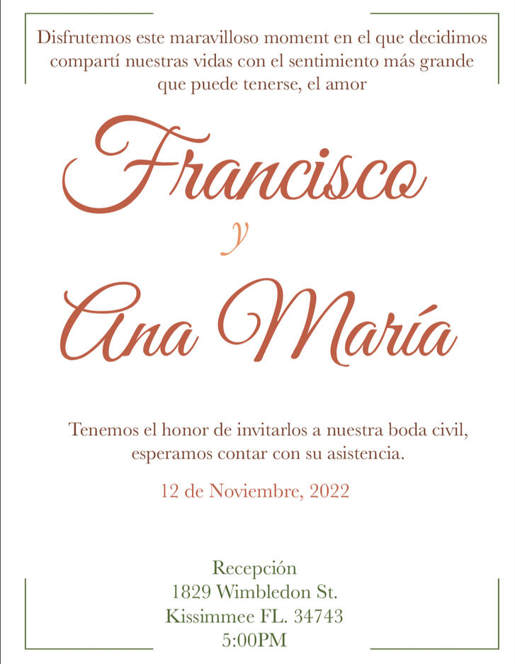
This was the final agreed upon flat version of the invitation.
All of the graphics were put together in Illustrator, and then composed in After Effects.
Client reported back very pleased with the invitation. The most interesting challenges I took away from this project was the language barrier. Making sure the typography worked in another language was my priority, and we were both pleased with the outcome. An animated wedding invitation is slightly unorthodox for English speakers, therefore most of my examples I used to construct the first mockup were also in another language. Yet I was able to get the gist of it and teach myself what to look out for and what elements to add.
Icon Study
This project was a four part project that focused on an object study. Each stage was called Elevation, Line Articulation, Graphic Translation, and Icon.
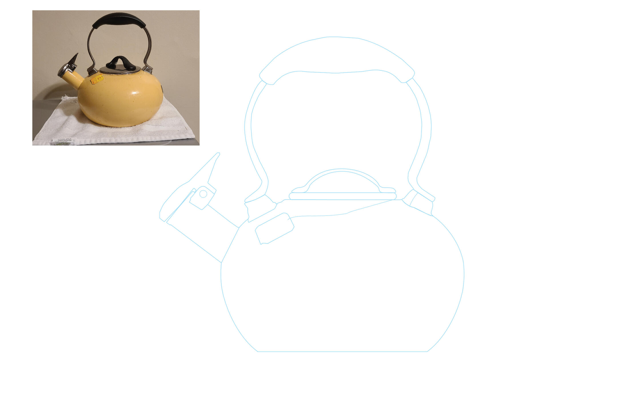
Elevation: An accurate depiction detailing an elevation of my chosen object, a teapot.
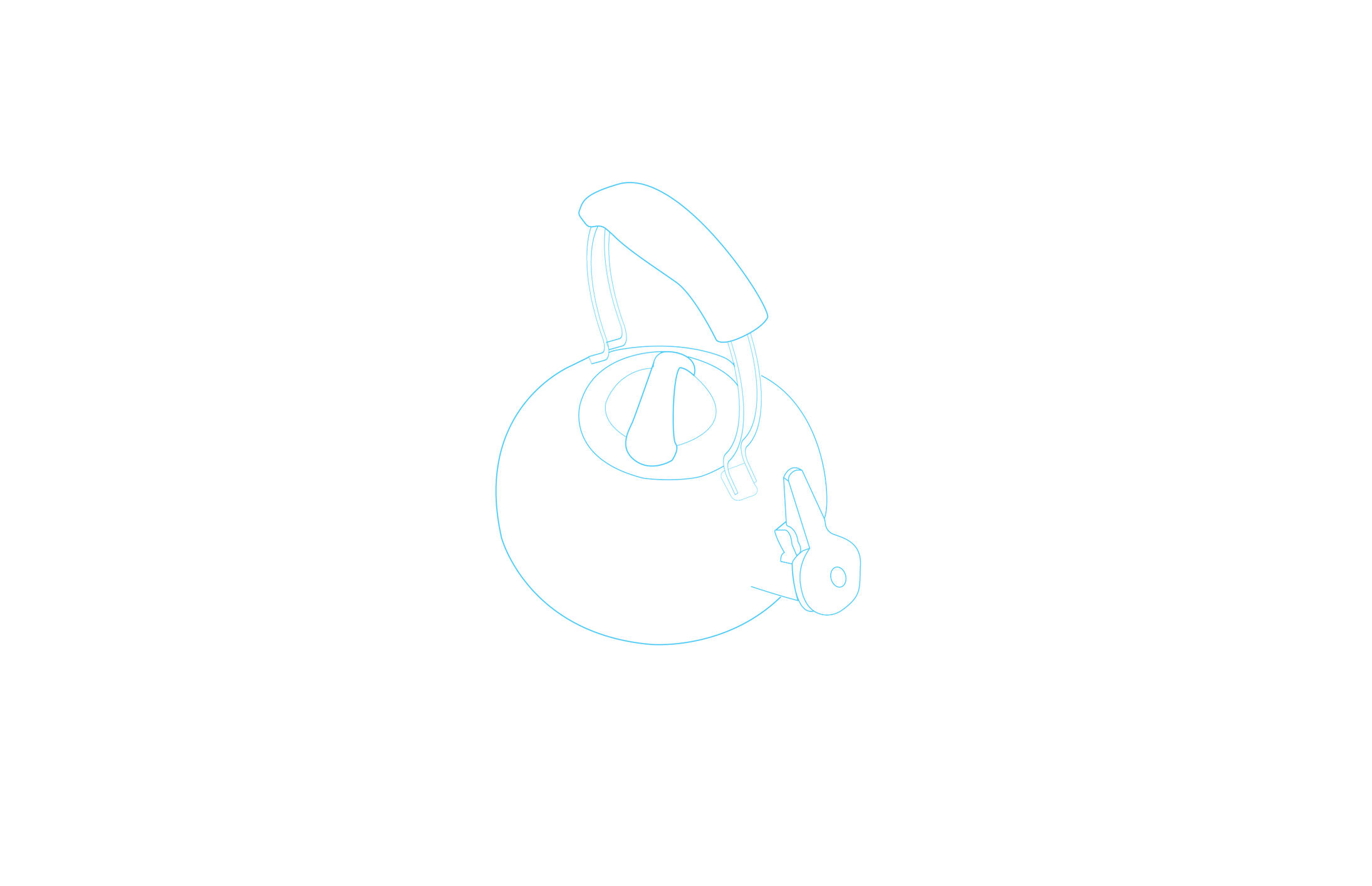
Line Articulation: An accurate line drawing of the chosen object, at a different angle.
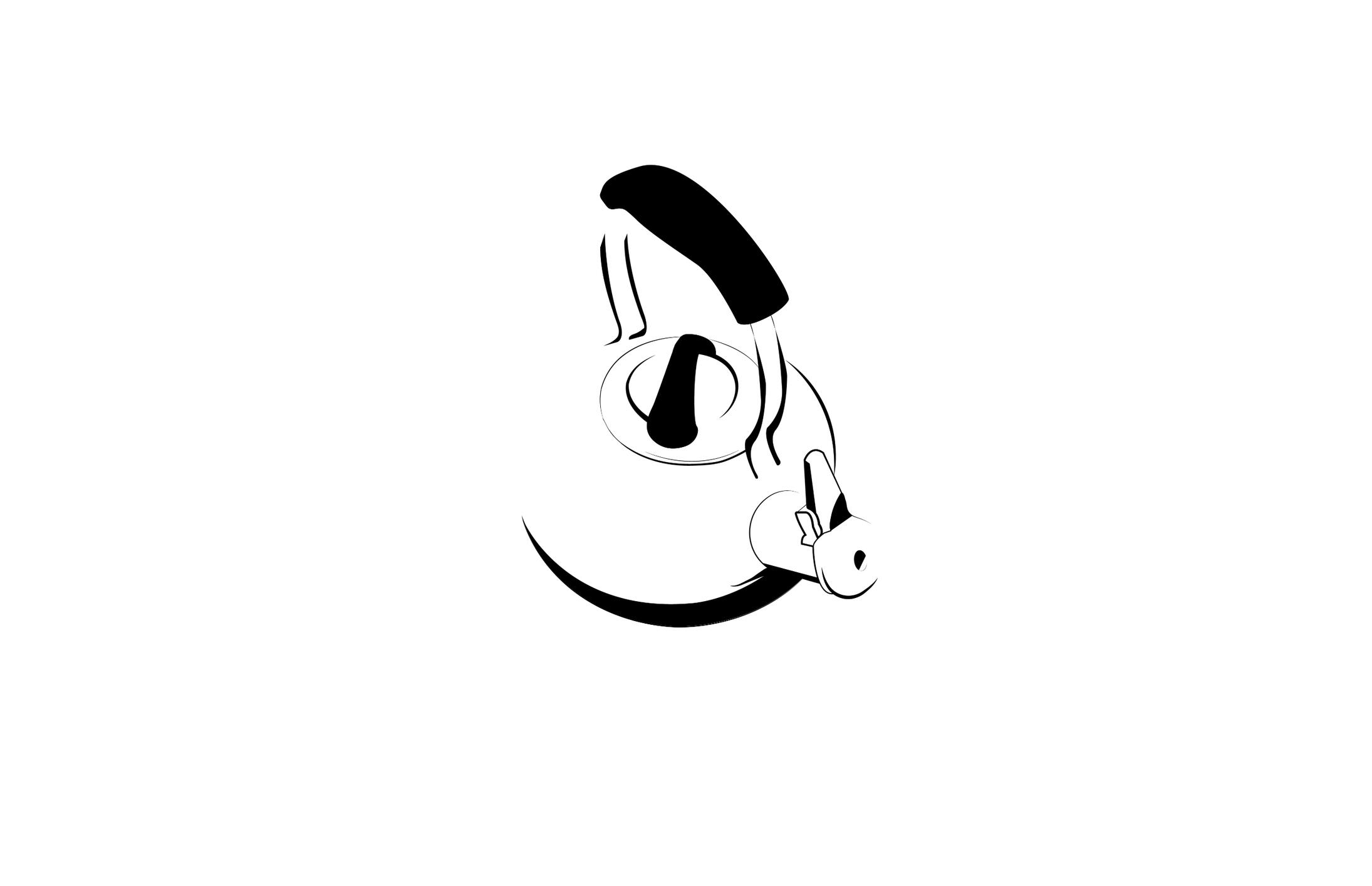
Graphic Translation: I took the line articulation and used line and shape in an aesthetically consistent rationale and visually dynamic manner.
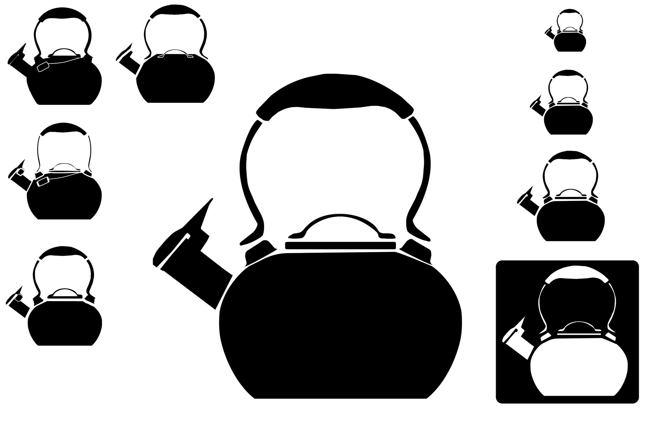
Icon: I turned my object into a flat icon. On the left side are alternate workings of what the icon could have been. On the right is the finalized icon at different scales.
Inklusive Icon
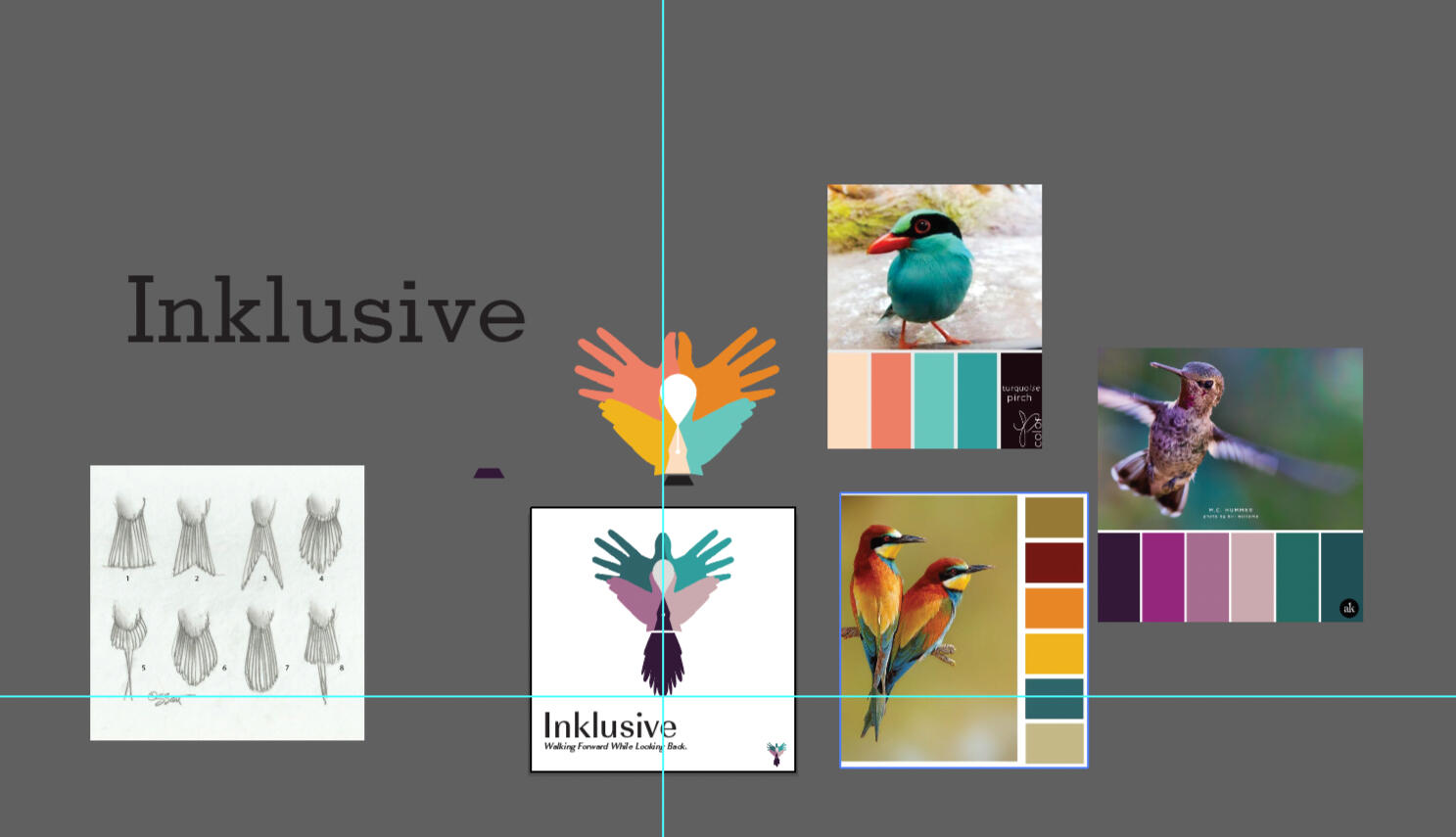
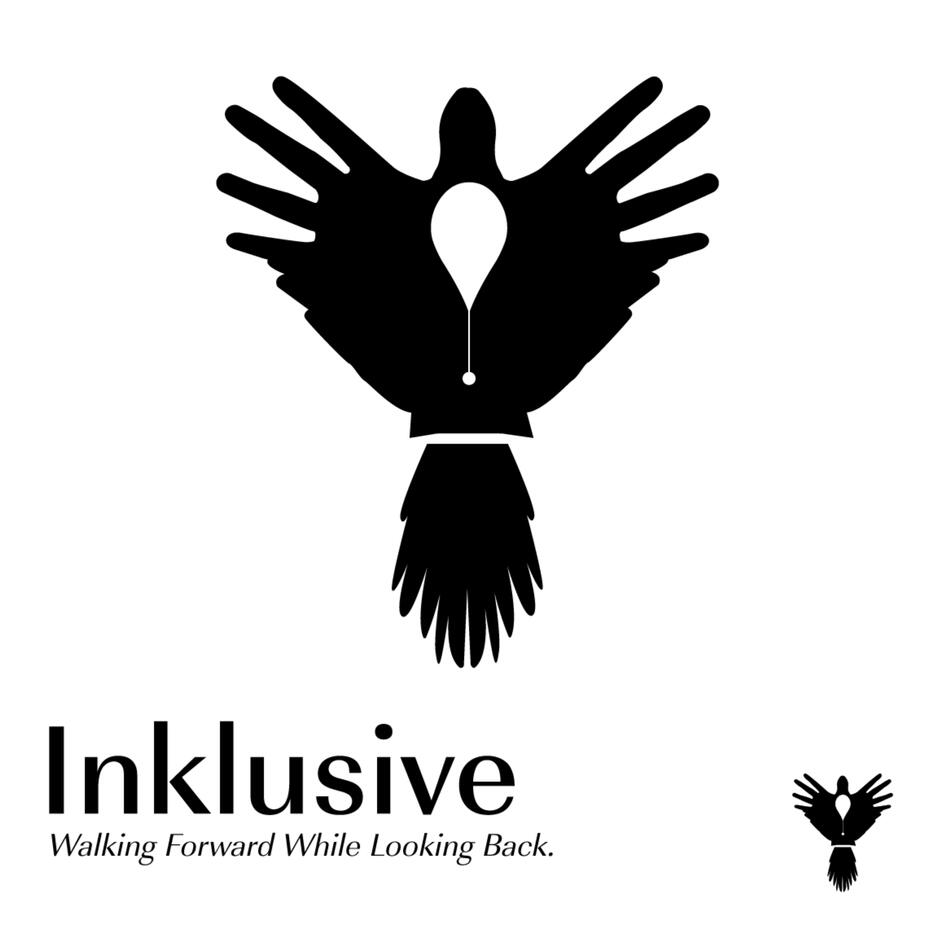
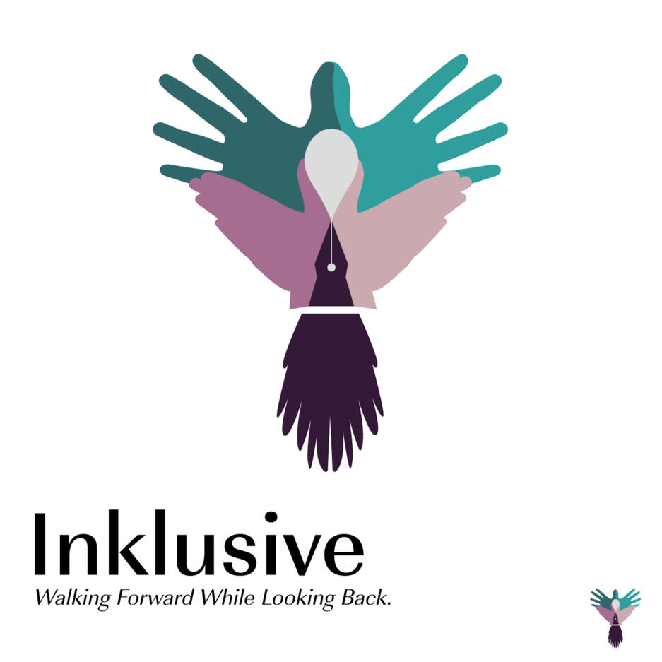
For a group project, I was tasked to create a logo representing us. Our focus in the class was history, specifically design history from cultures that have been traditionally pushed aside or oppressed. We combined the words ink (As in penmanship) and inclusive. Our tagline "Walking forward while looking back" means that while we look towards the future, we look back on the history that has captured the writing on the walls of our ancestors.For the logo itself, I used hands, different colored hands symbolizing diversity. I put them together as wings of a birds, symbolizing that when people share their cultures and histories, then anything is possible.
Moonjelly Cosmetics
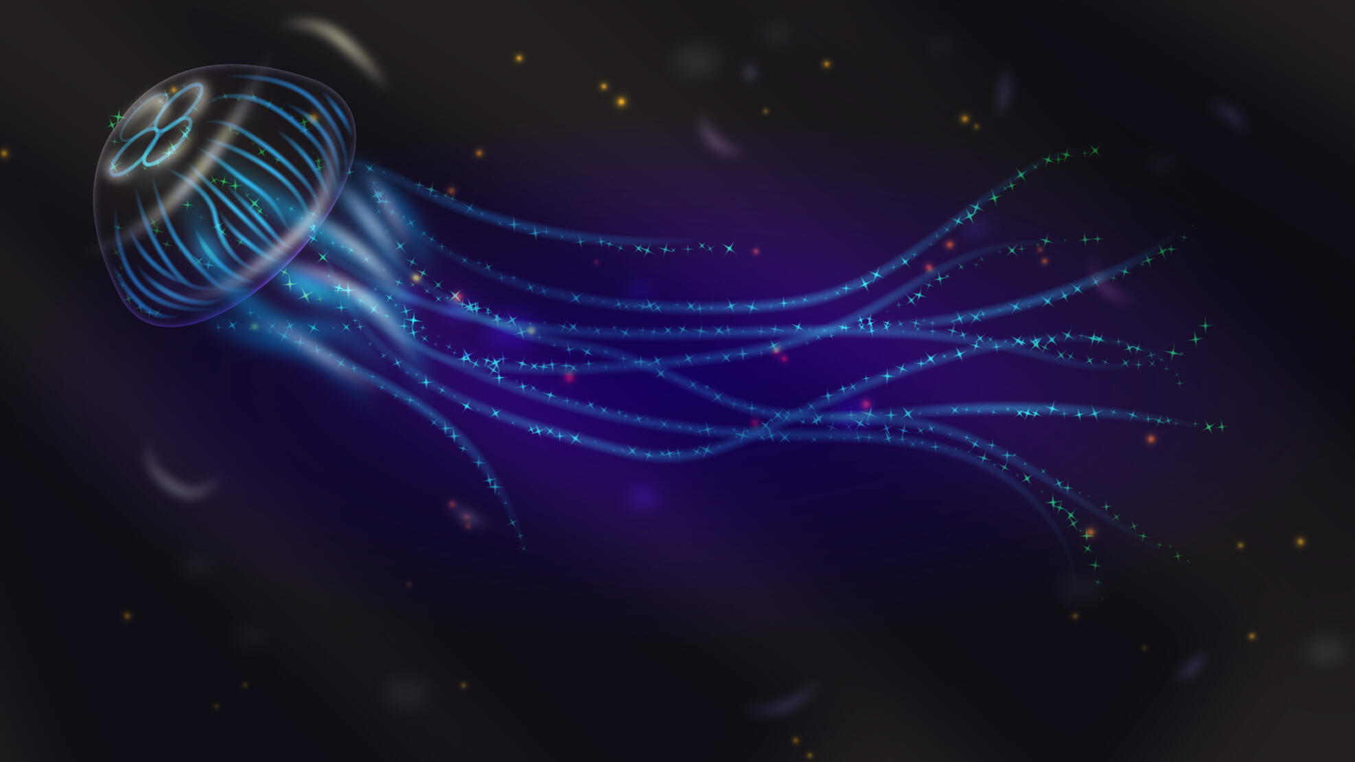
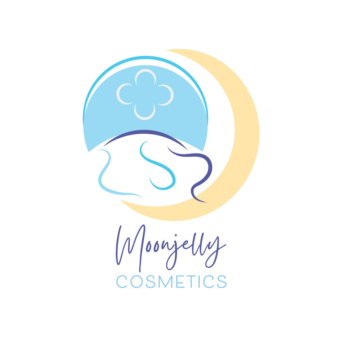
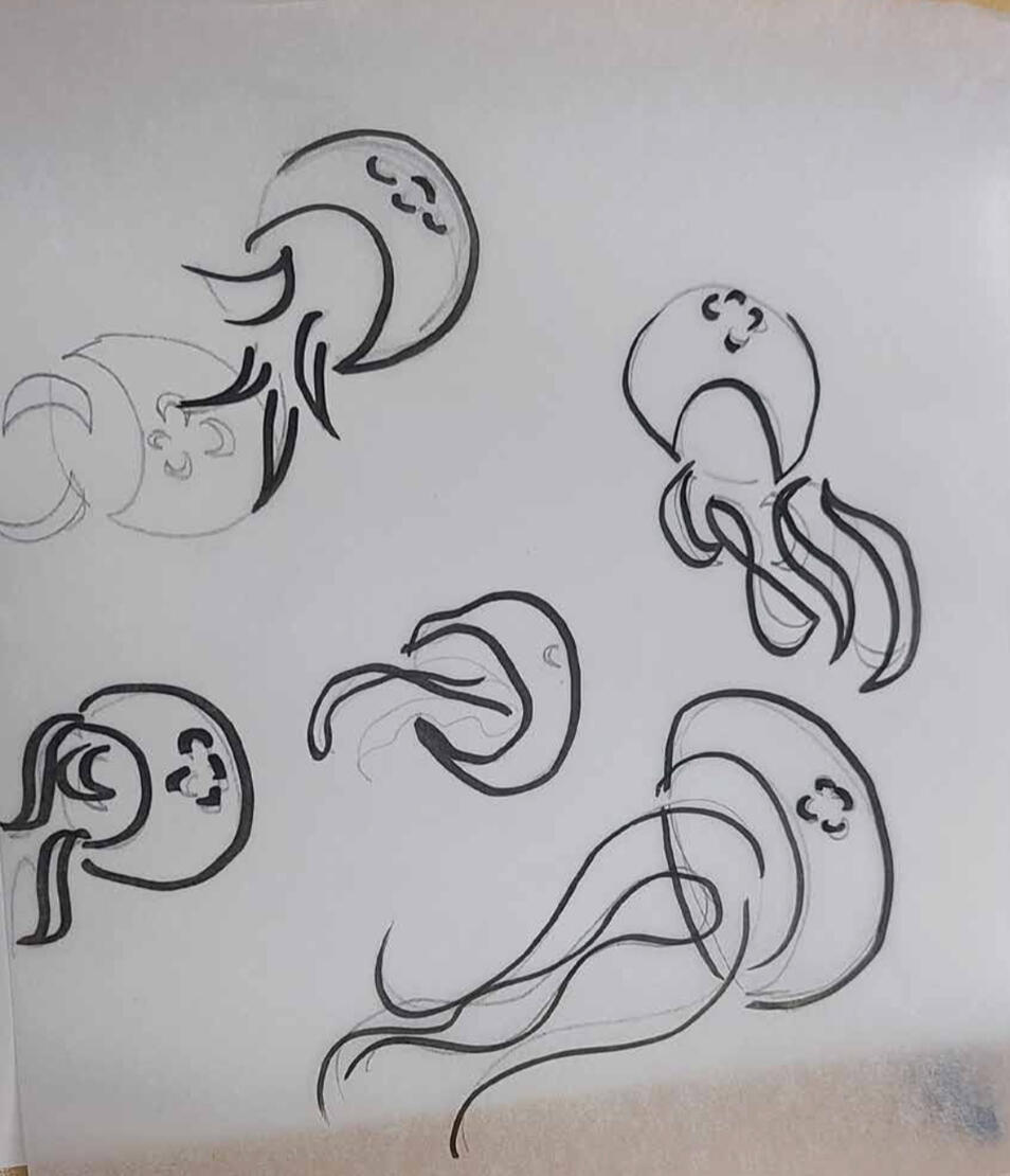
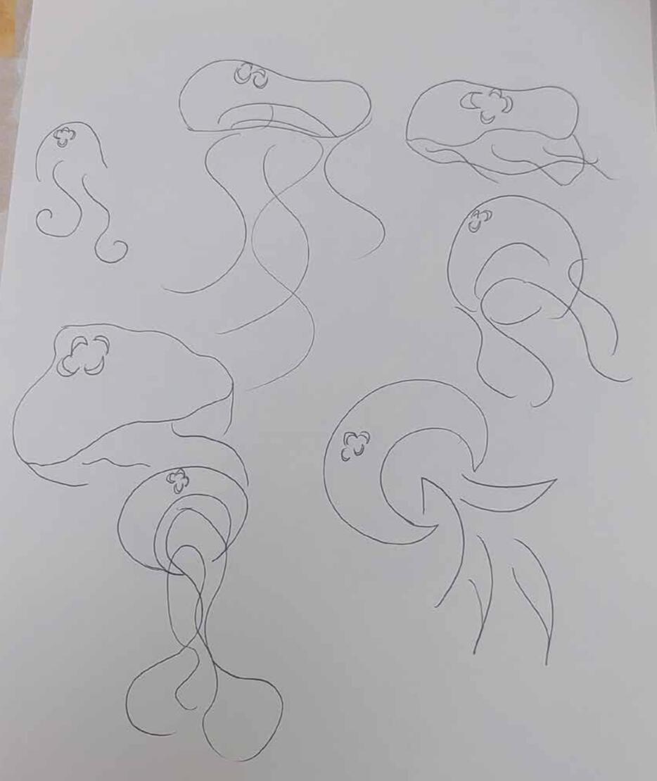
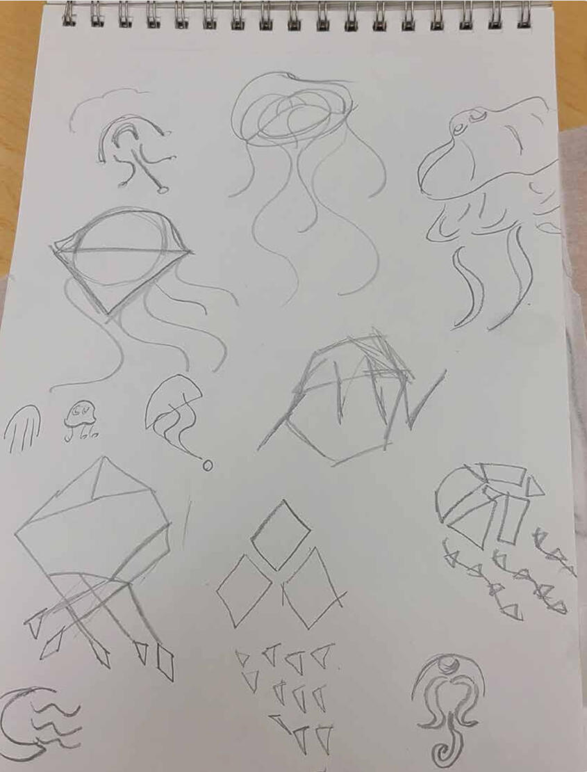
For one of my final projects, we were assigned to choose a "Spirit Animal" to develop a logo and some branding around. I chose the moon jellyfish because it is one of my favorite animals, and I love aquatic themes. Moon jellies don't have the longest tendrils like other jelly fish, so in some sketches I played around with the shape if the tentacles to make it more interesting.
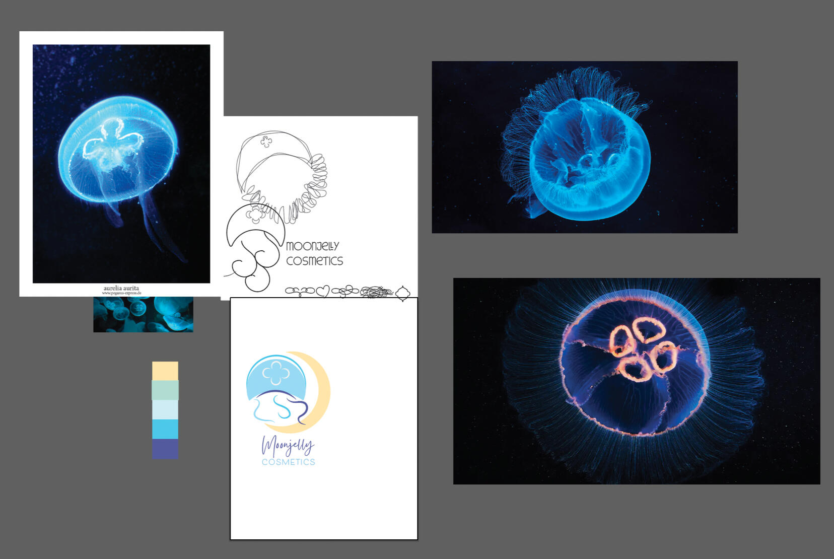
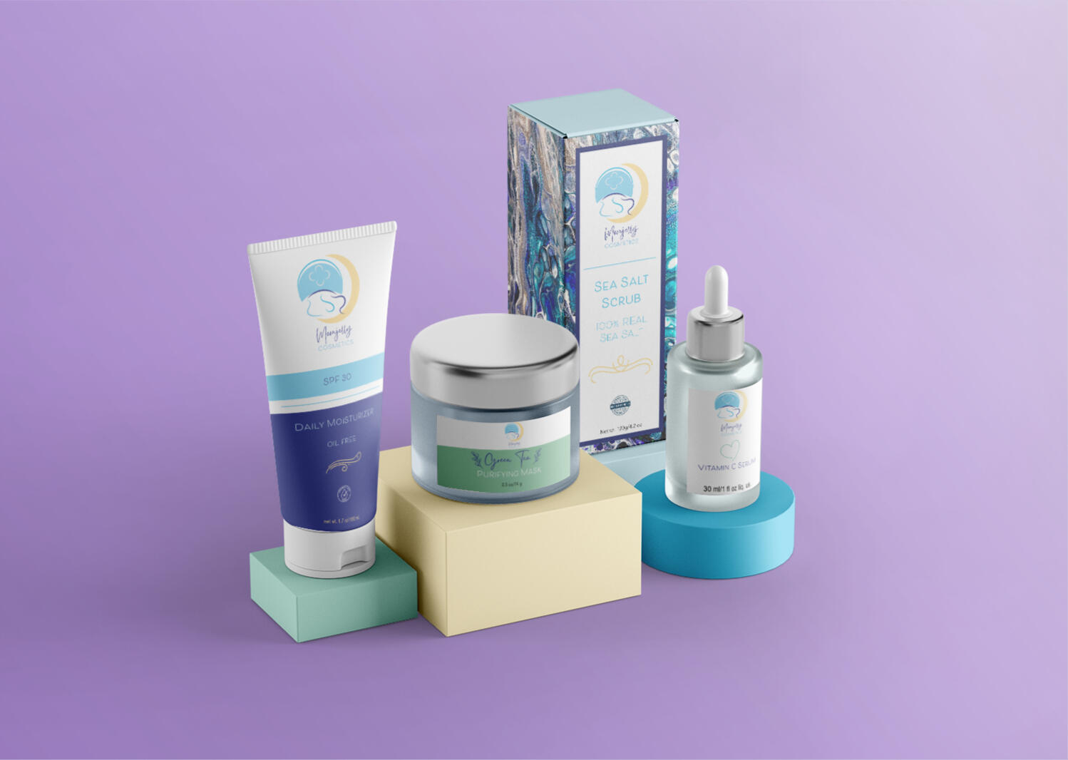
Referencing actual pictures, I simplified the jellyfish and kept the iconic mark on the top of their head for recognition. It is the same reason I added the crescent moon. The brand I ended up doing was a skincare brand, because skincare products are becoming more trendy, with things like jelly face masks. I wanted the brand to be sophisticated, yet something fun you would see advertised on Soko Glam.
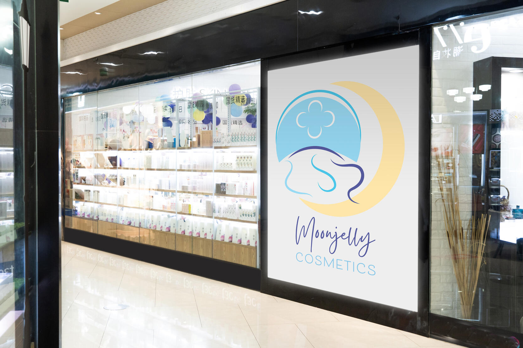
I imagined my hypothetical target audience to be 20-30s young women, the usual consumer of skincare. I colored the tentacles differently to lead the eye and add variety in the logo.
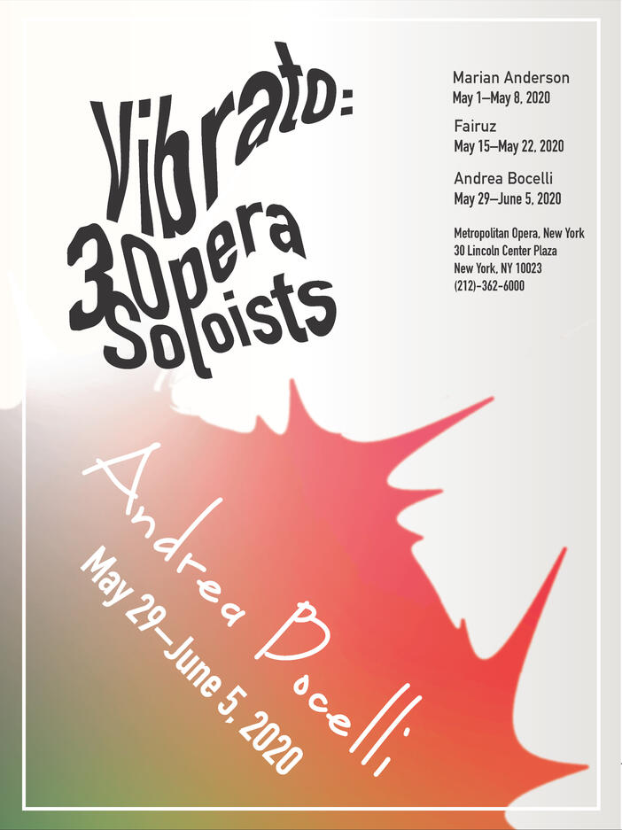
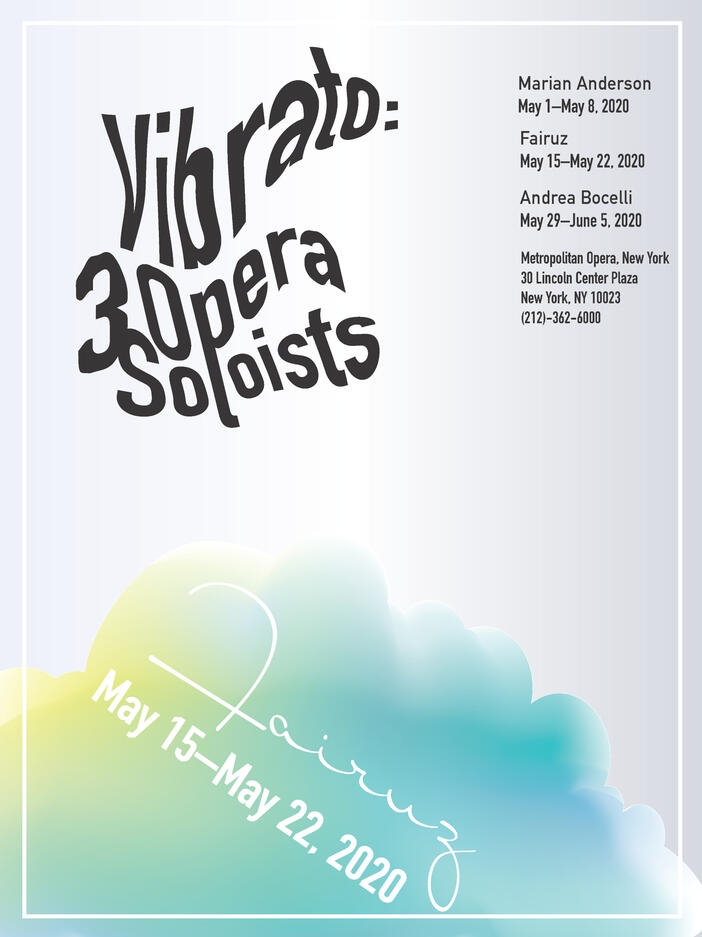
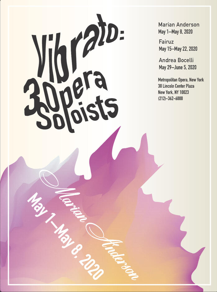
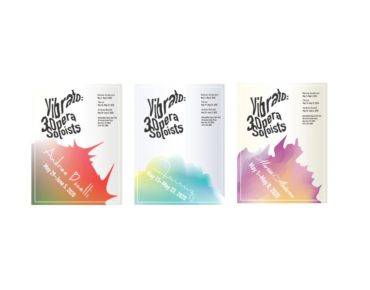
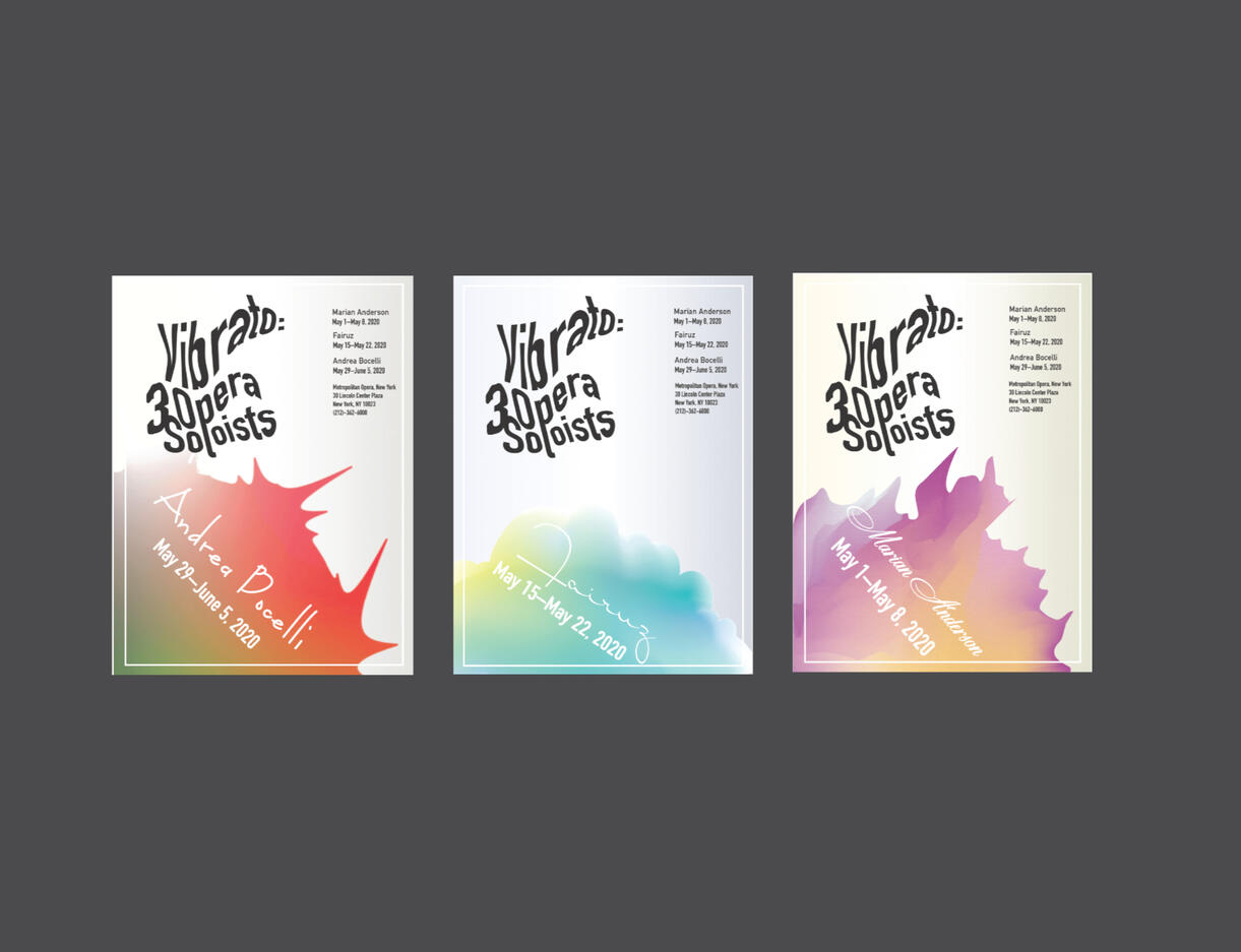
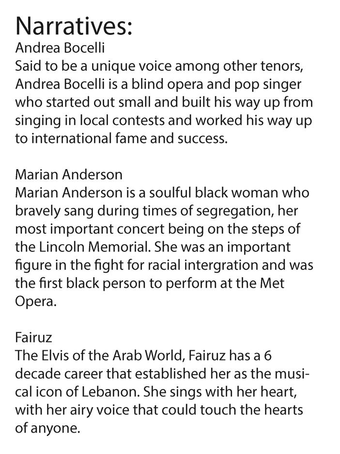
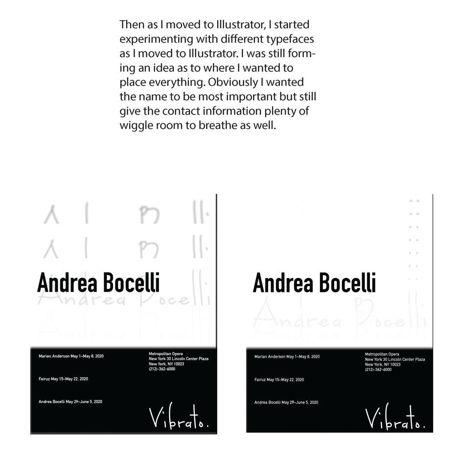
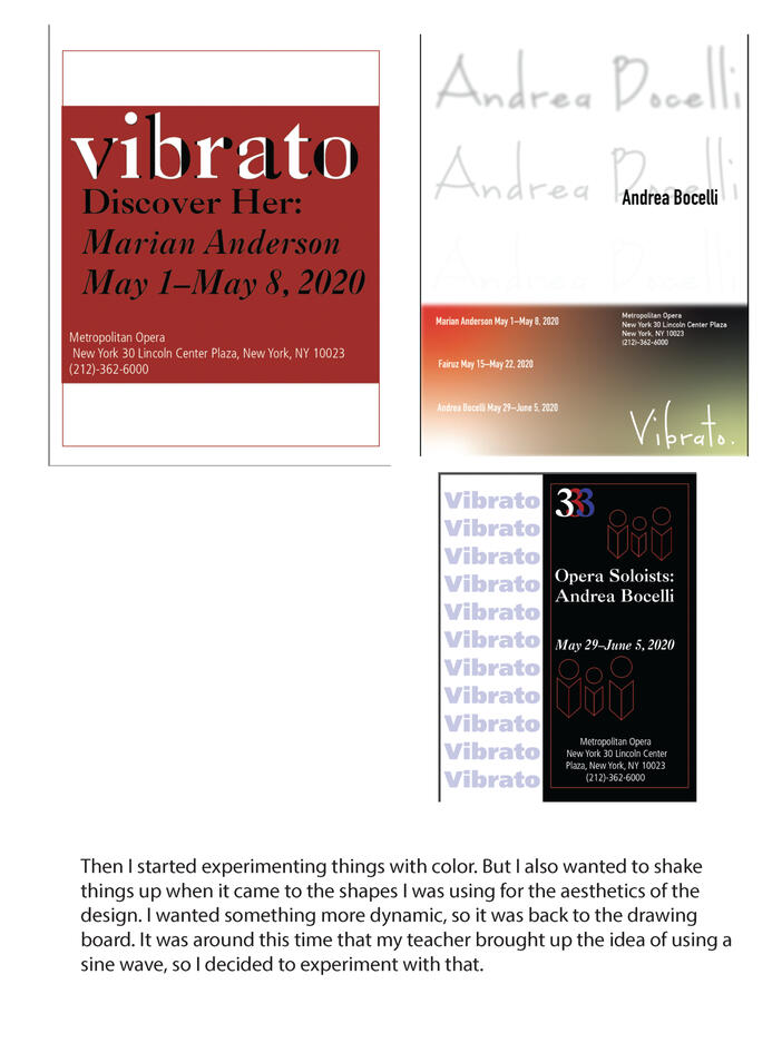
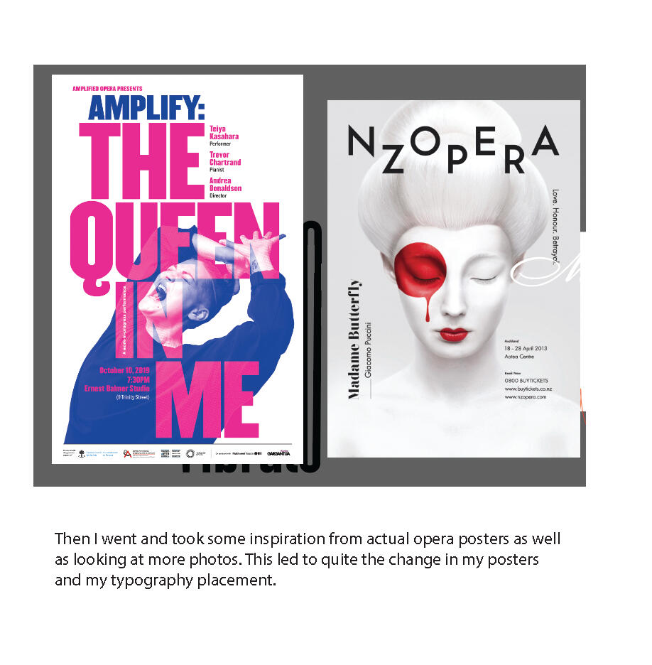
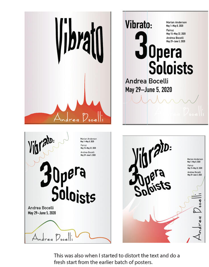
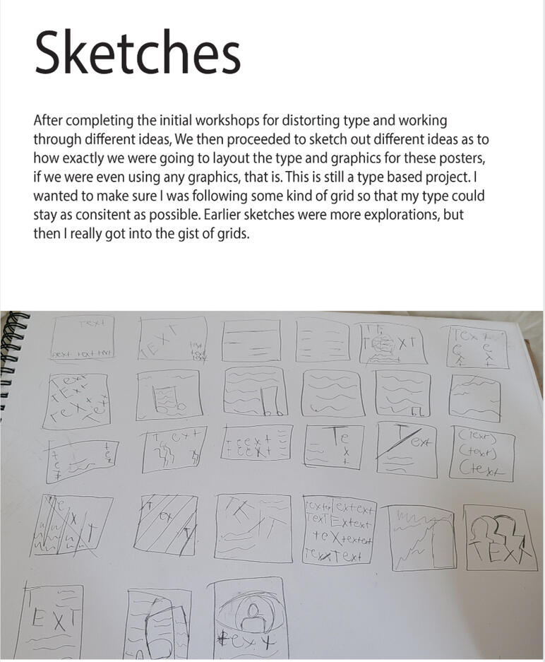
Vibrato Poster System
Process
AURCO Brand Design
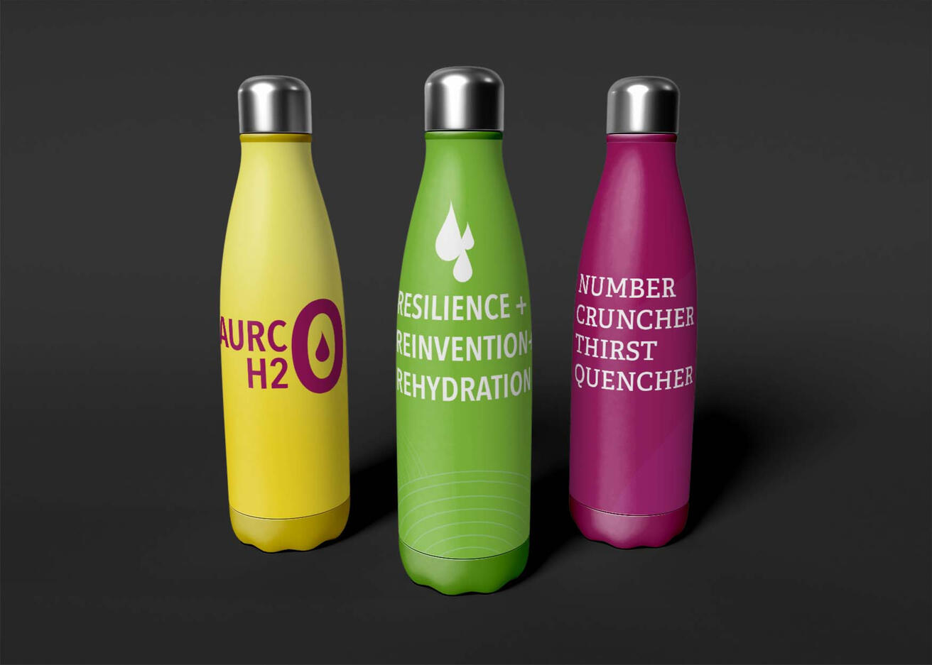
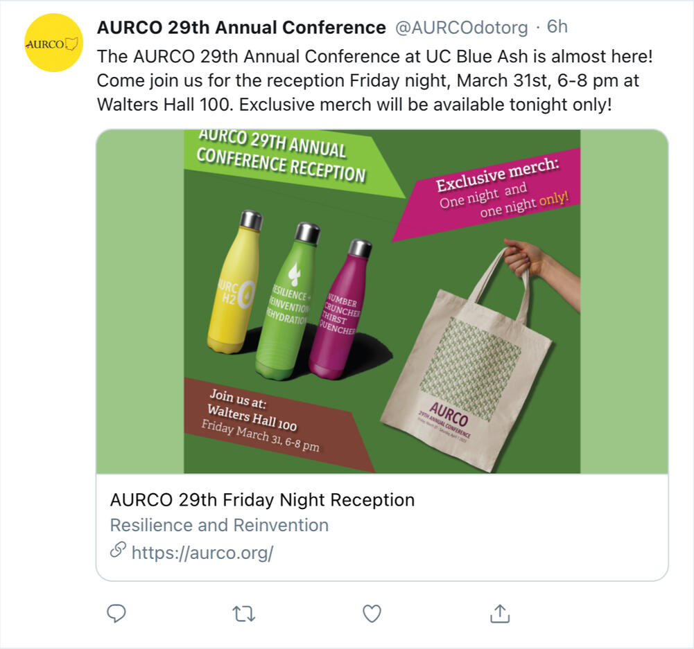
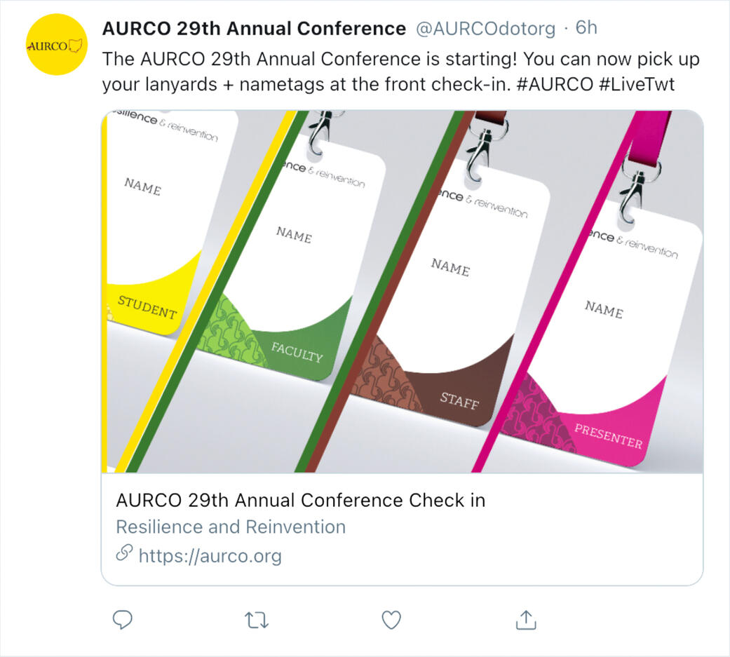
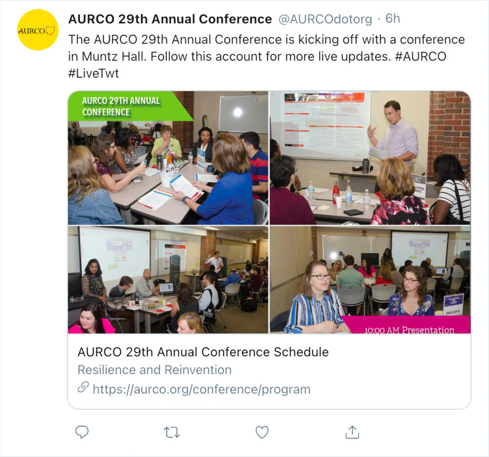
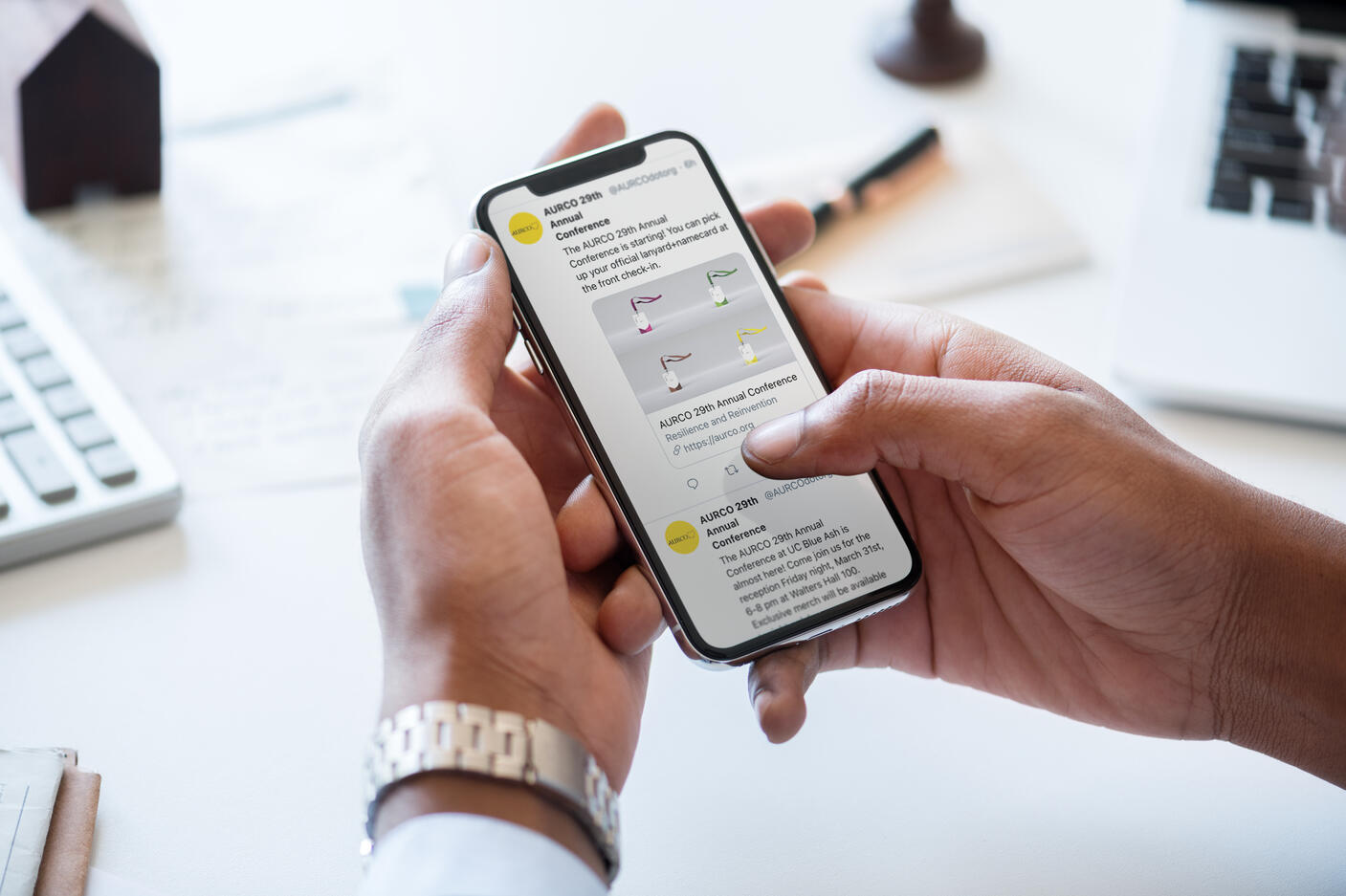
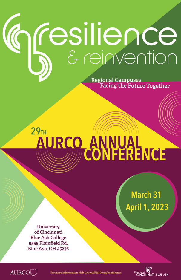
In 2021, AURCO, an organization for regional campuses in Ohio, approached my class for possible branding for the 2023 conference. We were given the tagline "Resilience and Reinvention".
After a color scheme, typography, texture, photos, and a logo were decided, I worked with others in a group project to not only design posters, but also promotional ads and ephemera guests would receive upon attending the event.
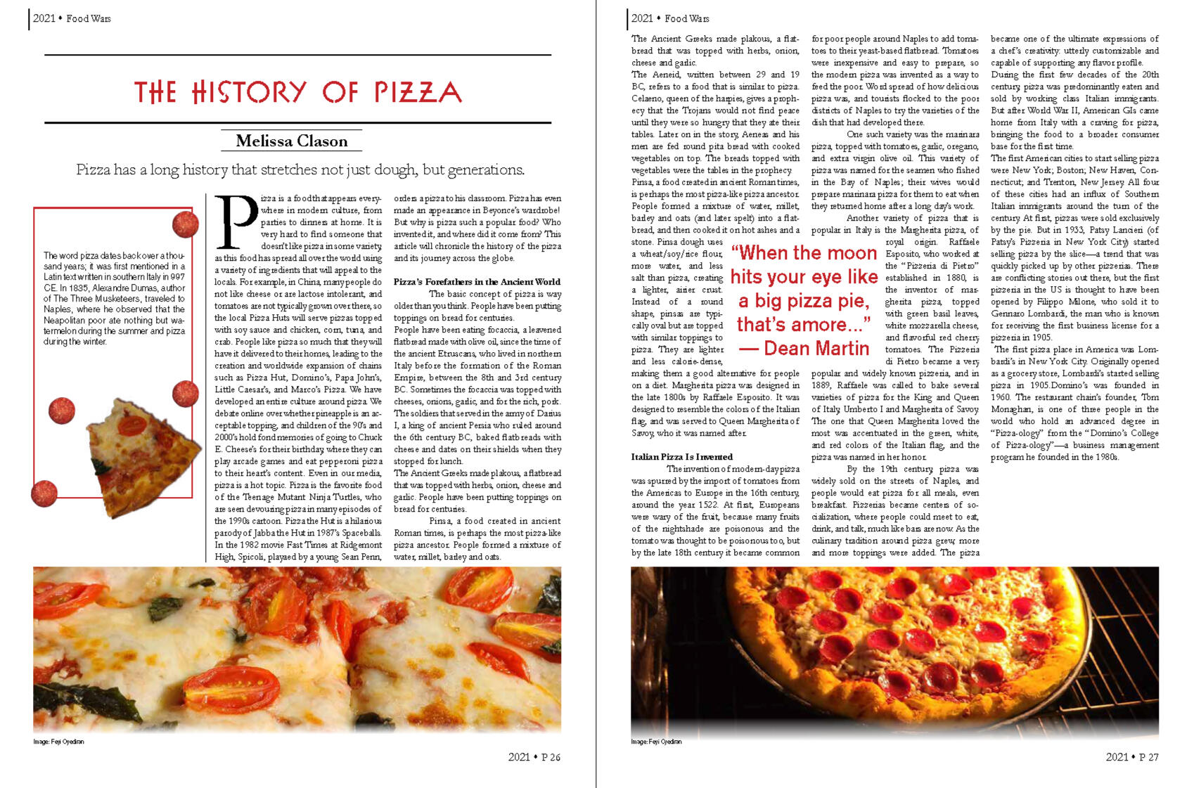
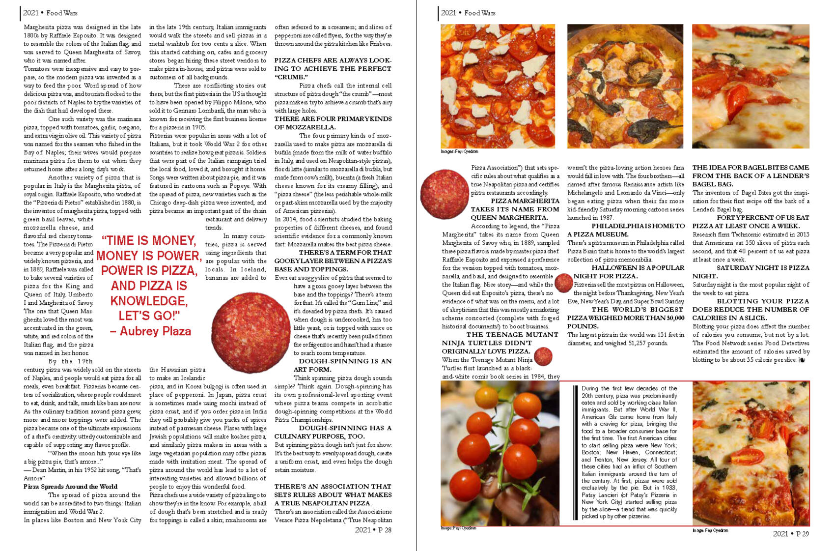
Pizza Magazine Layout
Resumé
